
A mobile-friendly website is a website that can run the same way across devices, without any changes or missing on a computer or mobile device.
However, some features are limited and are difficult to be used on mobiles like, navigation drop-downs and no Flash animation is used instead.
As global mobile usage keeps growing, an overwhelming number of hotel bookings are coming from smartphones to the hospitality industry. People now are Five times more inclined to leave a web unless it is mobile-friendly. Now is a good time for tech-savvy hotels to upgrade the mobile-friendliness of their website, and as a result, generate further conversions.
Continue reading to know more about what a Mobile-friendly website looks like, and how to make sure your hotel site hits the mark.
First, let's know what a Mobile-friendly website is :
A mobile-friendly website has a responsive design that allows users to read text EASILY, navigate around and fill out forms using various device types. Sounds simple, doesn't it? So, what about the boutique hotels out there that failed to pass the Mobile-friendly check on Google?
Quite often, the texts are hard to read because of the small screen size, in which the menu does not appear the way it should, or links are difficult to be click. But the worst thing that could ever happen is the mobile site's slow loading time, which makes people run away and leave immediately.
Yet it's not supposed to be this way, Right?
But how to tell if your hotel website is mobile-friendly?
Here are some questions, you will figure out if your website mobile-friendly or no after you answer:
First thing first, put yourself in the User’s shoes by experiencing your website.
Start with Entering your website address into your phone’s Internet browser and then evaluate it against the following checklist :
- Can you read the text easily on the phone, without scrolling right or left or zooming in or out?
- Does your website load smoothly? (Switch your connection from WiFi to your phone data plan to experience the lower data speed.)
- Can you see all of your site's main content in one or two views?
- Can you get to various pages rapidly, and find what you are searching for?
If you stated "no" to these questions, then you're missing a lot.
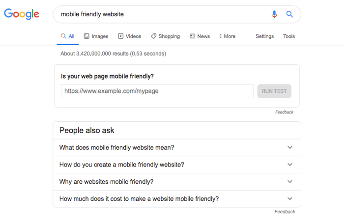
There are many other Online tools used to test whether the website is mobile-friendly or no, and the easiest and 100% is from the source itself Google.
- You can go straight to Google and search for Mobile-friendly Website as below
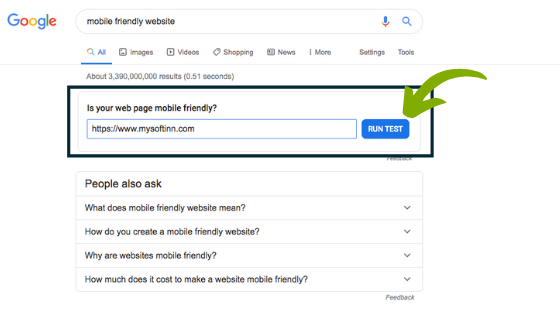
- Enter your Website URL and click on RUN TEST
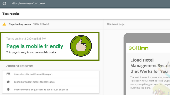
- You will get the results to know whether your Website is Mobile-friendly or No by following these easy steps.
Conclusion
Whether or not your website is mobile-friendly has a huge impact on how Google Search performs on your website. It has been widely known that websites that are not mobile-friendly have been lowered in Google's SERP as users search from a mobile device. You want to ensure that your Web page visitors stick to your website and get satisfied when viewing from all different devices.

Softinn Author
Meet Softinn mascot, the friendly face behind our stories! Always curious and a little mischievous, they love sharing tips, insights, and a sprinkle of fun with every post. When not helping our readers, you’ll find them exploring new ideas, dreaming up adventures, and making sure our brand stays lively and approachable.
Comments
Recent Posts
Low-Cost Hotel Tech for Budget Hotels in 2026
Xiaohongshu (RedNote): How Chinese Travellers Discover Hotels in Malaysia
How to Choose a Hotel Booking Engine in 2026
How to Train New Hotel Staff on a Hotel PMS (2026)
How to Promote Your Hotel on Xiao Hong Shu (RED / REDnote): A Practical Guide for Malaysian Hoteliers