When websites were first designed and developed, they were pretty much built to be navigated on a desktop or computer. In this digital age, most browsing activities are done via smaller devices especially smartphones. Thus, websites need to be mobile responsive to make it easy for users to navigate.
The growth of technology makes the definition of mobile-friendly changed especially when it comes to website design and development. To better understand, a mobile-friendly website means that the website performs well on a mobile device like a phone or tablet.
What does a mobile-friendly website mean?
1. Responsive Design
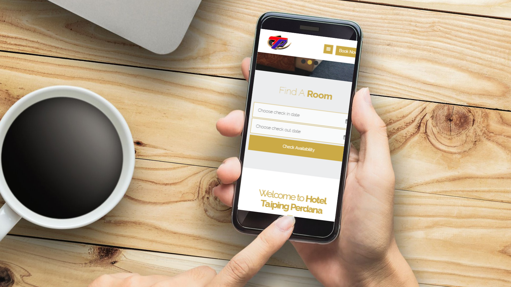
A responsive design website is where you can see how responsive the website looks on different types of mobile devices including IOS, Android, tablet, and more.
In other words, no matter what size screen the visitor is viewing your website, the text, navigation, design, and images are performing well and readily adapt.
2. Separate Mobile Site
The separate mobile site is also known as the m dot site. A separate website can be built by developers and it doesn't need to look like the main site. Example:
Mobile site: https://m.facebook.com/
Non-mobile site: https://facebook.com/
3. Clickability
Mobile-friendly websites should also focus on the ability to click like drop-down buttons and menus. Like how it works on desktop and computer, it should be easy to click on a mobile device as well.
Either business or leisure travelers, each of them should have at least one smartphone nowadays. We believe that mobile phone leads them to make a faster decision when they are searching for the accommodations.
Read: Why hotel needs a mobile friendly website?
If you are not sure whether your hotel website is mobile-friendly or not, you can run a test by using tools that you can find on the Internet or you may check out our blog here: How to test if your hotel website is mobile friendly.

Comments
Recent Posts
Low-Cost Hotel Tech for Budget Hotels in 2026
Xiaohongshu (RedNote): How Chinese Travellers Discover Hotels in Malaysia
How to Choose a Hotel Booking Engine in 2026
How to Train New Hotel Staff on a Hotel PMS (2026)
How to Promote Your Hotel on Xiao Hong Shu (RED / REDnote): A Practical Guide for Malaysian Hoteliers